BBC News Responsive Redesign
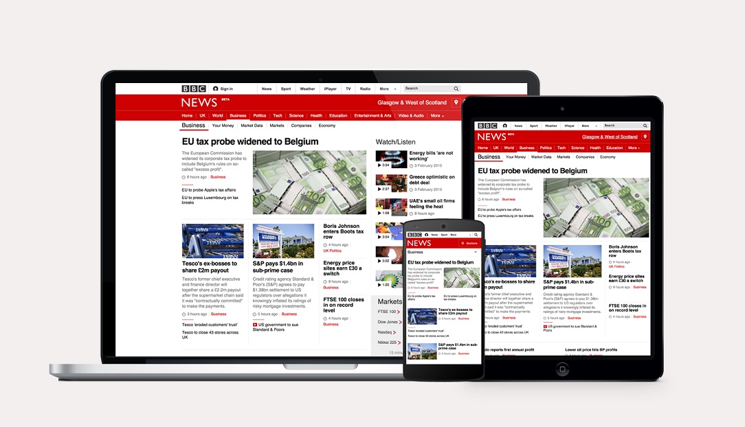
In 2012, BBC News embarked on a journey to completely redesign and re-engineer the News static site into a fully responsive mobile first site.
The responsive site was in the first instance built and released targeting mobile devices. The objective was to make way into a fully responsive desktop site progressively. By rationalising and simplifying our design patterns into a single codebase, we could efficiently build 28 other World Service sites from a standard set of components that are language and script agnostic.
In Oct. 2013, I joined BBC News. Since then, as a UX Designer, I led and helped improve many parts of the holistic BBC News experience.
When
2013 - 2015Client
BBC NewsPlatform
bbc.co.uk/newsHats Worn
• UX Lead • Ideation • Wireframing • Visual design • Prototyping • UX research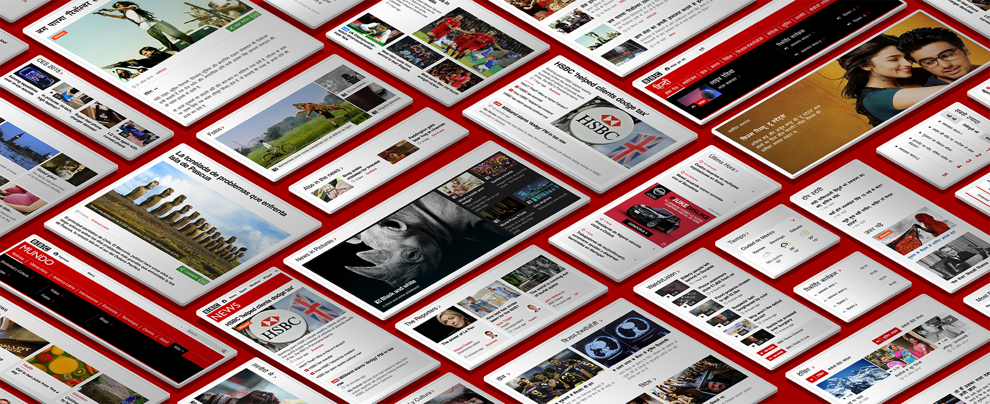
My Role
I led and helped improve many parts of the holistic BBC News experience.
I launched the UK and international BBC News sites and helped launch 28 World Service responsive sites.
I was part of a multidisciplinary team of 8 designers working across BBC News. I collaborated with teams of Designers, PMs and Engineers across the BBC to help standardise visual and interactive patterns.
My role as a UX designer was to foremost advocate for user goals and evolve the BBC News online strategy by working closely with Editorial & Product.
I contributed to the visual and interaction design, built several high fidelity HTML prototypes used for usability research in London, Bristol, Mexico City, Delhi and New York.
I designed in the browser and other visual design tools to solve complex tasks by simplifying the problems into easy-to-use, accessible and intuitive solutions.
I paired with engineers to solve unforeseeable design problems and ensured final builds adhere to the BBC accessibility standards.
Challenges
How Might We create the best BBC News Responsive site without alienating our core audiences?
How Might We retain components' hierarchy across breakpoints?
How Might We provide an optimal content density of top stories above the fold while accommodating for differing ad formats?
How Might We improve the articles reading experience and onward journeys?
Design Process
Audience & Competitor Insights
The first part of my work was to understand how the BBC News site was performing by uncovering audiences' pain points through analytics insights, and by researching our competitors to identify trends and patterns.
DESIGN PROCESS
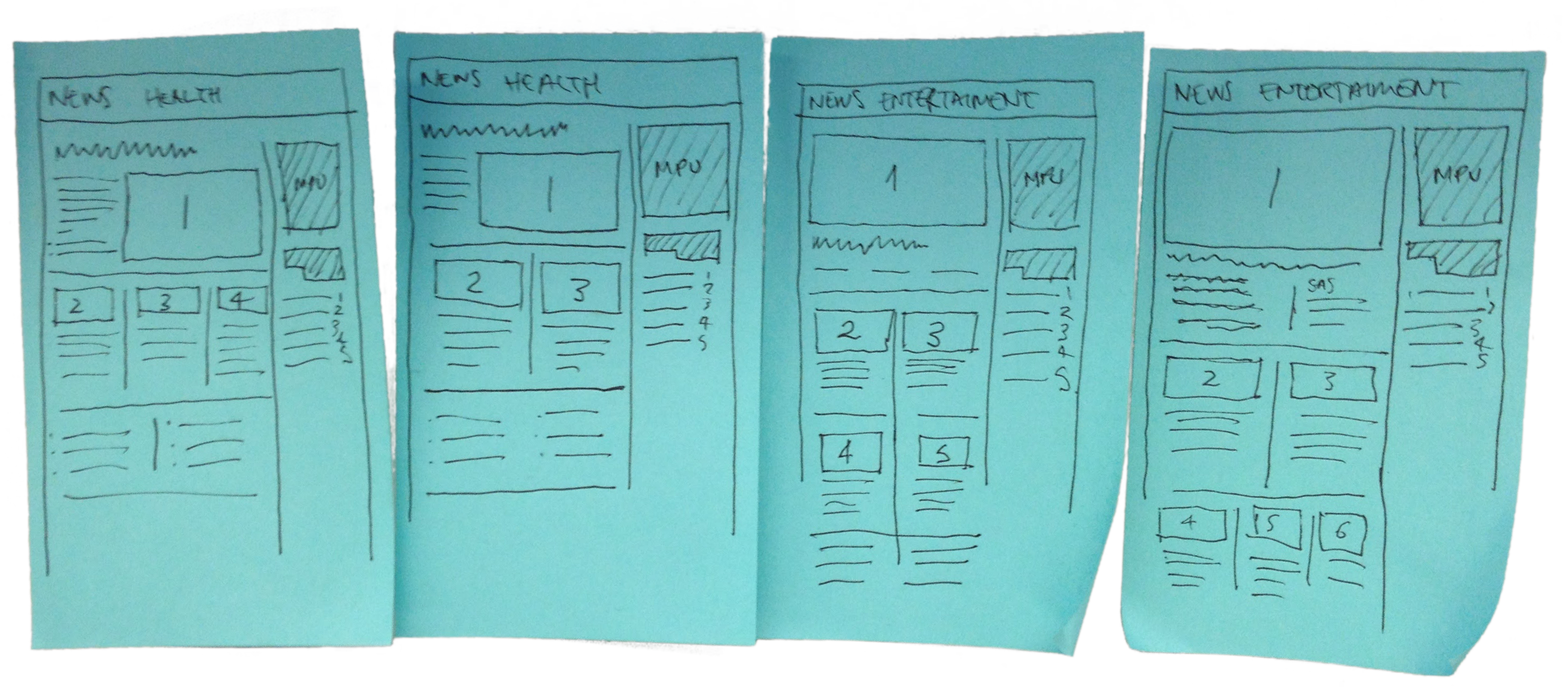
Wireframe & Ideation
To help tackle design challenges, I created low fidelity wireframes and sketches to help identify a particular user and business need.
We discussed ideas and wireframes during team critique sessions before creating any high fidelity designs.
DESIGN PROCESS
Stakeholder Workshop
In this project, I helped run workshops with editorial teams across BBC News. The workshop had two main objectives:
- Define content groupings and identify editorial needs for each of the 28 World service sites.
- Educate editorial teams to think mobile first when creating content, and demonstrate how content on the BBC News responsive website reflows across different device screens.
DESIGN PROCESS
High Fidelity Designs
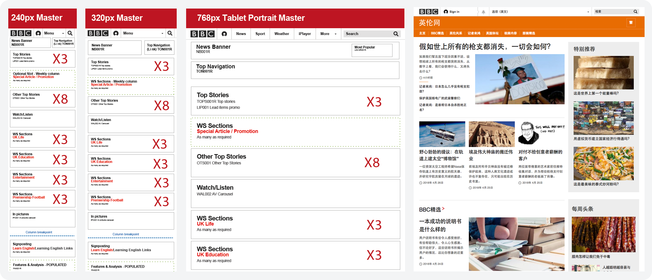
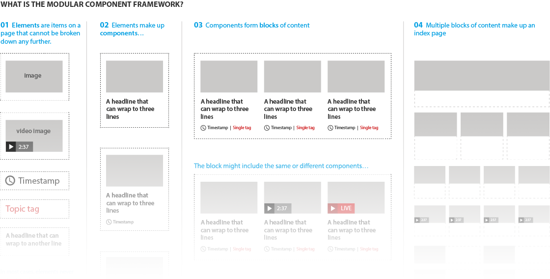
The BBC News site was designed using a standard set of rules and components to simplify the build process. We refer to it as The Modular Component Framework.
I designed high fidelity mockups in Adobe Illustrator using the BBC News Modular Component Framework.
DESIGN PROCESS
High Fidelity Prototypes
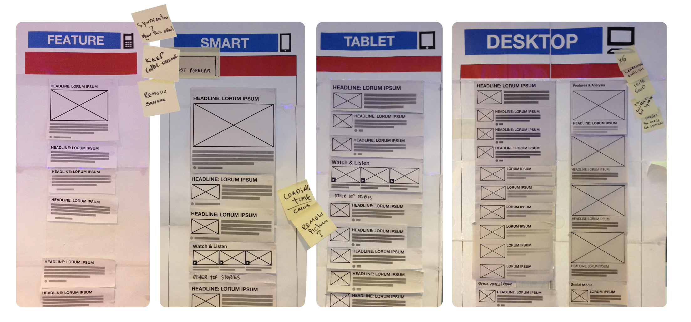
I have built desktop only and responsive prototypes in HTML/CSS/JS to validate designs in usability testing sessions, and to engage and gain buy-in from stakeholders. I built prototypes to help solve design challenges before they occurred during the build phase.
Check the prototypes below
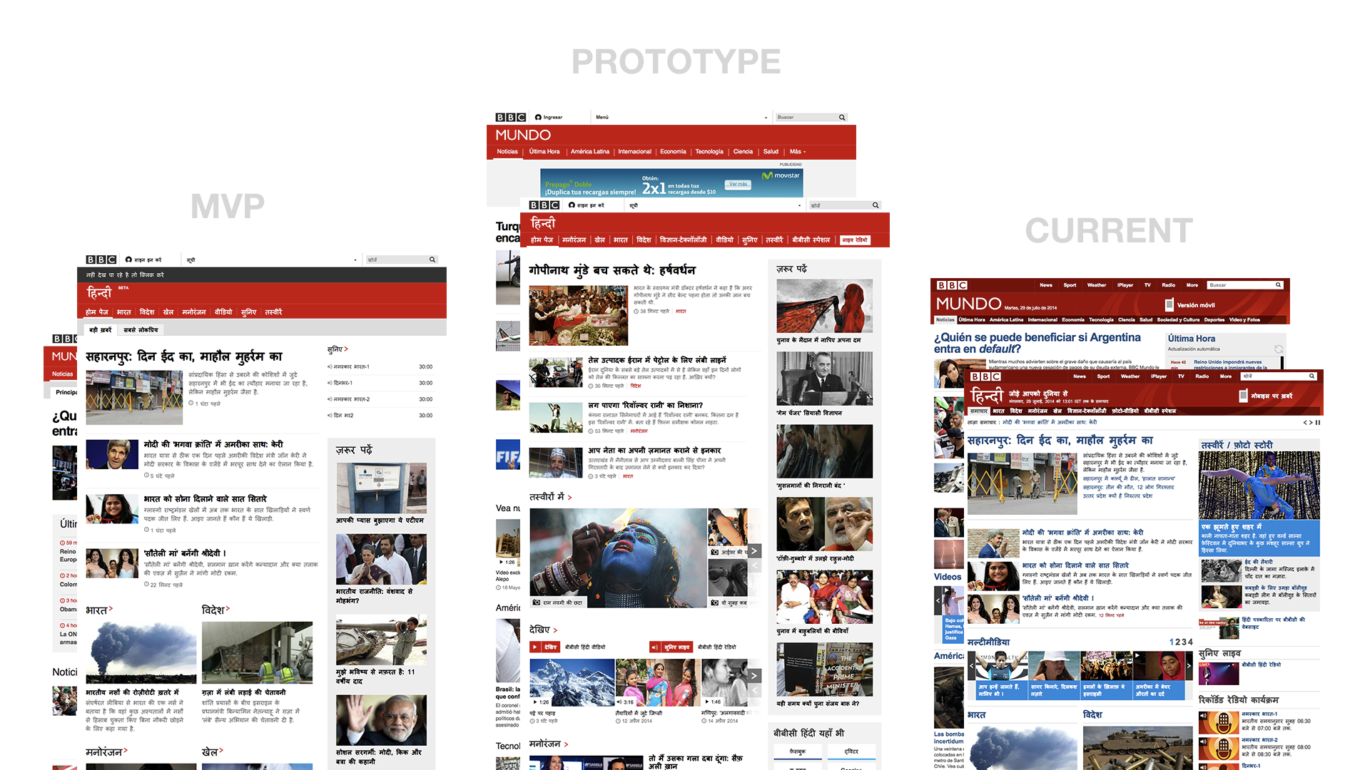
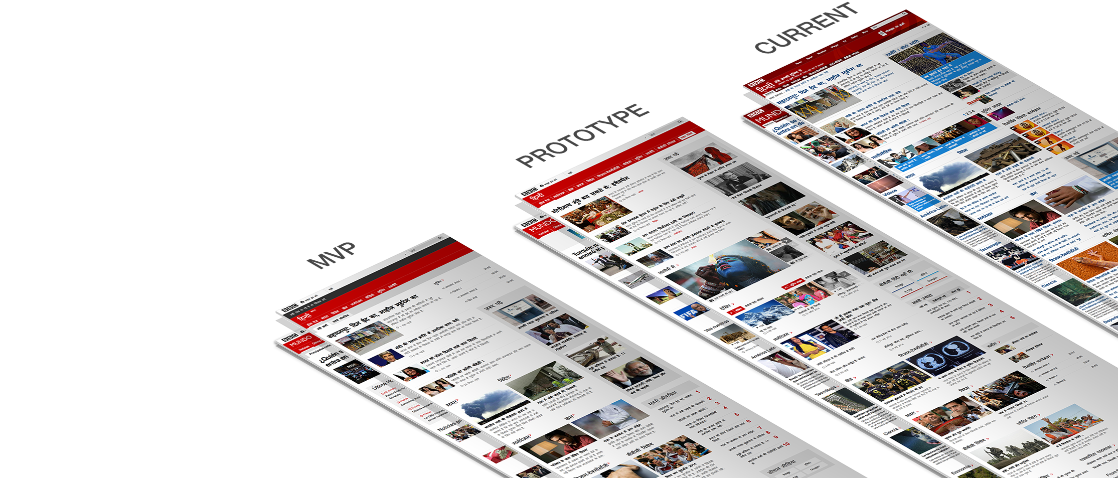
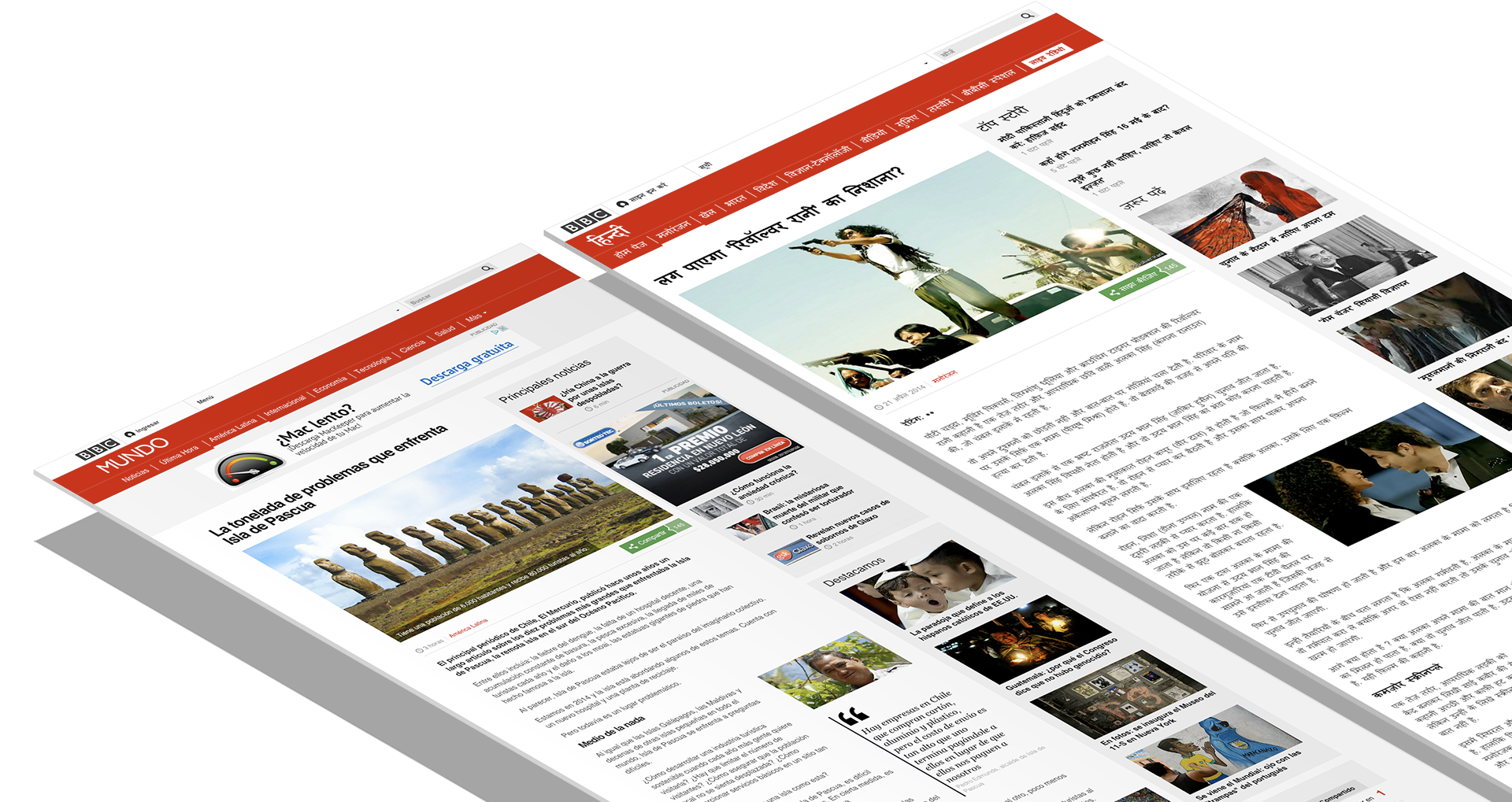
May 2014 - BBC Mundo Research Jun 2014 - BBC Hindi Research Oct 2014 - BBC News Int'l Edition ResearchJan 2015 - Responsive BBC News HP Final Designs
DESIGN PROCESS
Usability Testing
Once we were happy with the designs, it was time to put them in front of our audiences around the world.
A total of 42 one-to-one 90 min interviews were conducted in Mexico City, Delhi, New York and Bristol.
For each of the locations, I've built prototypes for BBC Mundo, BBC Hindi, BBC News International and Domestic Editions.
The outcome of this research, informed our design decisions that lead to the public release of the first BBC News Responsive sites.
The following research findings for BBC Mundo & BBC Hindi, was presented by myself during the BBC News monthly UX team meeting. The information is based on my own findings and the research done by Foolproof.
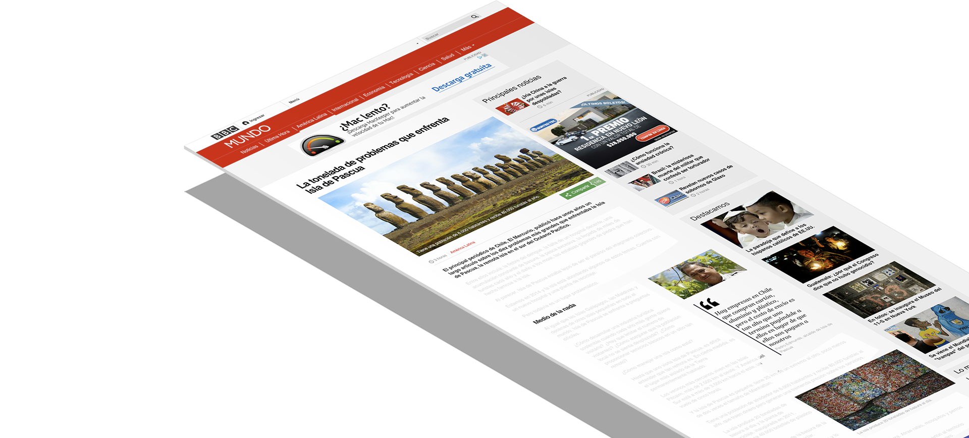
BBC Mundo & BBC Hindi Research
Methodology
21 one-to-one interviews were conducted with approximately 90 min each. 10 in Mexico City & 11 in Delhi (2 days in each country). Each of the interviews were moderated by a native speaker with direct translation in english.
At the end of each exploration activity respondents were given a set of cards with adjectives, each with a single word written on it. They would them be asked to select the cards that best describe the site.
Research Objectives
This research proposed to assess the overall proposition in terms of: (1) layout & hierarchy, (2) page length, (3) content density, (4) reading experience, (5) line length & inline modules, (6) navigation discoverability, (7) onward journeys, and (8) assess the new responsive MVP against competitor desktop sites.
BBC MUNDO & BBC HINDI
Research Overview
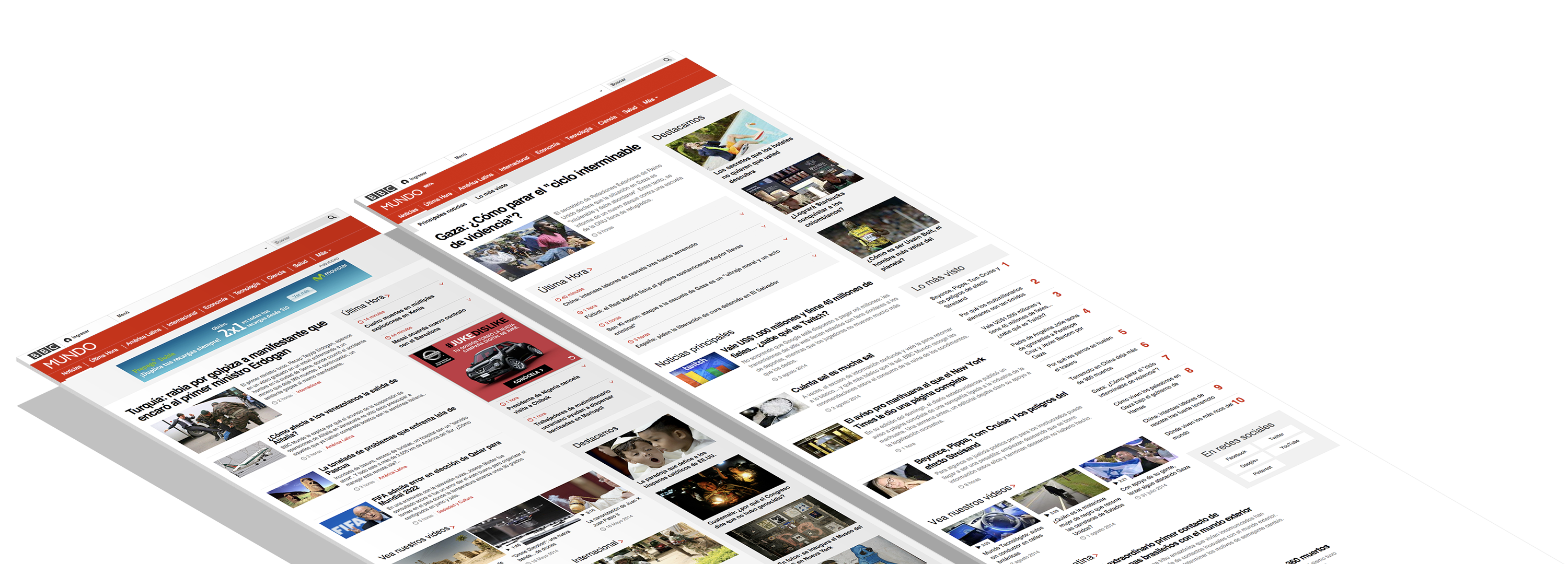
Prototype was the favourite choice
From all of them the prototype was the one preferred by the majority of the participants of this experiment. The current website was the last of the choices, even when compared with the MVP.
“The style is good, makes me want to read. I like it more than my usual provider. This doesn't confuse.”
RESEARCH OVERVIEW
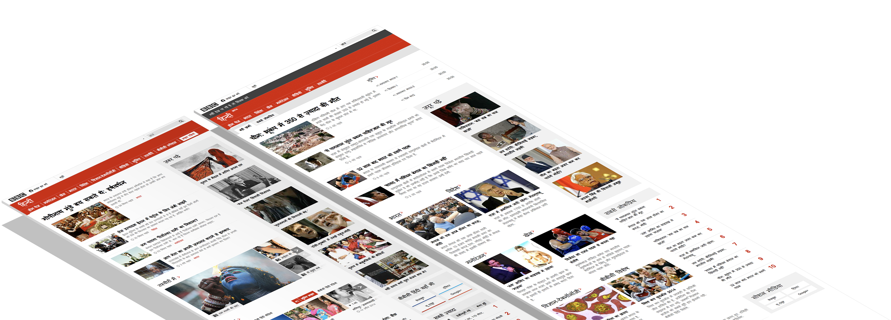
Greater Structure
In terms of structure, all respondents reacted positively to both MVP and Prototype. However, the Prototype presented a greater structure in the eyes of the participants. In general the prototype seem to be more clear and easy to operate.
“I don't have to use the search. The categories and the clarity of the images make it easy to find what I want.”
RESEARCH OVERVIEW
Better use of images
The prototype makes best use of images, helping to give structure to the page and to better connect and illustrate the News stories.
“Images help structure the page.”
“I don’t need to read the story to know what it’s about.”
Navigation
Simple and easy to use
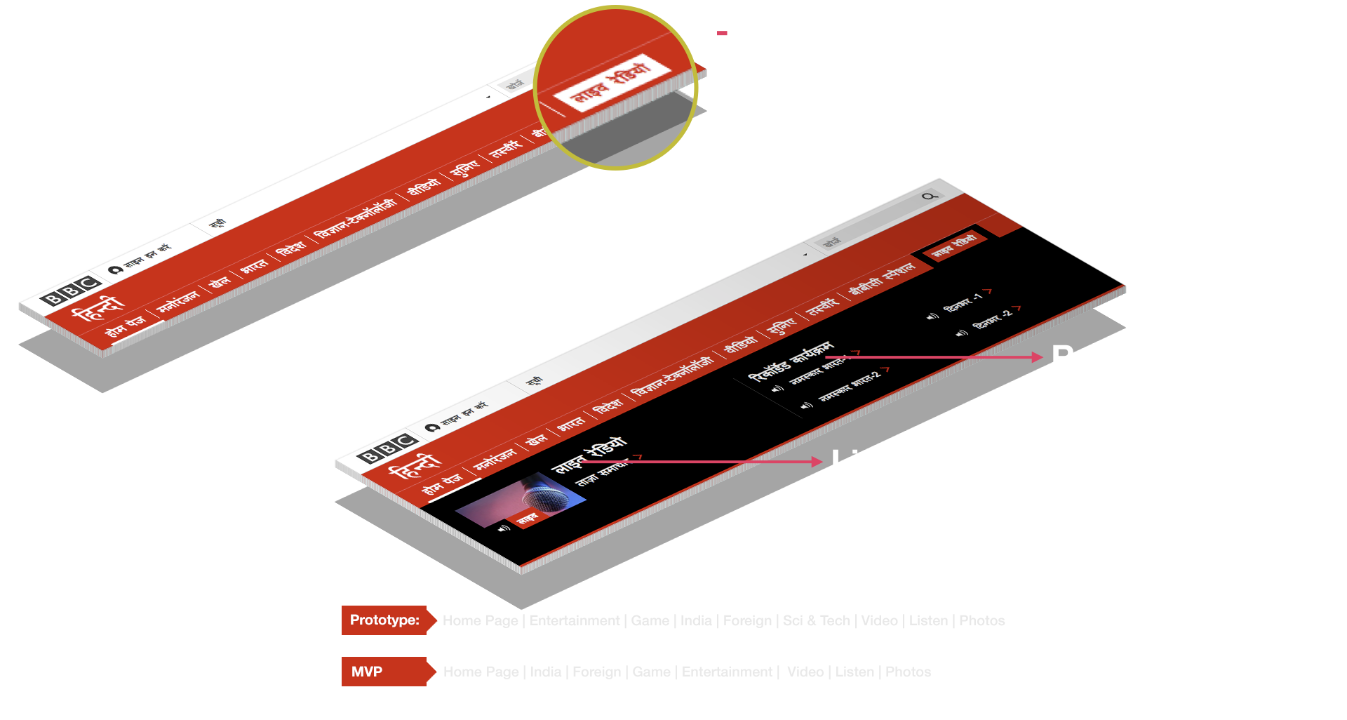
In Mexico all respondents located “Sport” without difficulties (Hidden in the more section). In India the order of the nav items wasn’t appropriate. Serious content should come first.
BBC Mundo
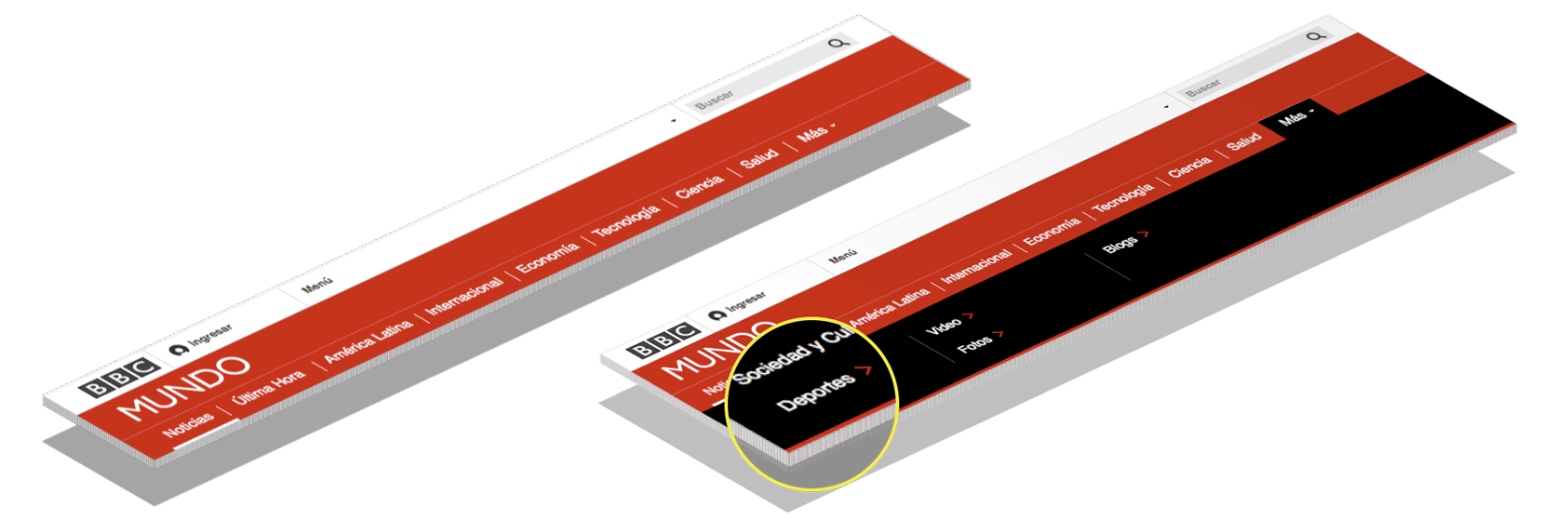
NAVIGATION
BBC Hindi
Live Radio – Respondents thought the live radio badge would open a live radio transmission
“The categories should match a newspaper. More serious first, sport at the end.”
BBC MUNDO & BBC HINDI RESEARCH
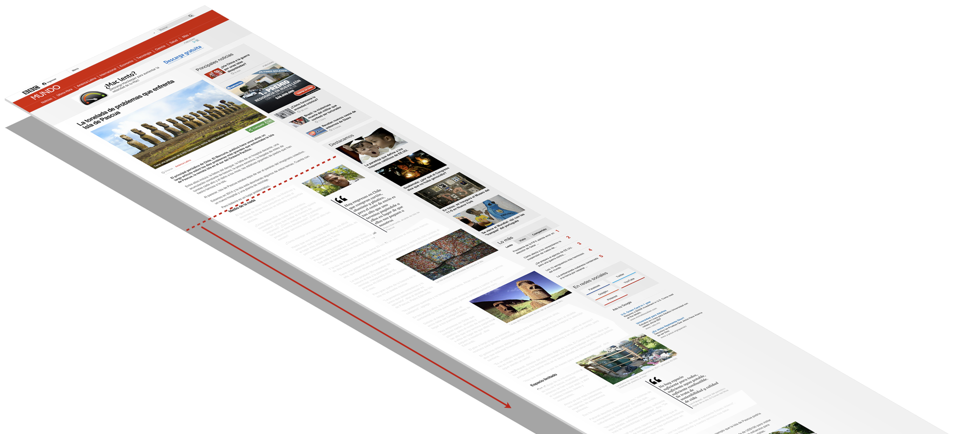
Index Pages
We noticed that the respondents tended to skim read the content of the page. Mainly the used categories, images and headlines to choose which stories to read. Also, the majority used only Images to identify the story, rather then by reading the Headlines.
Category, Image & Headline
In Mexico, the Headlines perceived too small. Nevertheless, Category, Image and Headline were more important then the copy detail.
“I don’t need to read the story to know what it’s about."
“The pictures help to make choice on story to read. You see the picture and want to know what is going on. It's the picture always."

INDEX PAGES
Timestamps & Topic headings
The timestamps were seen as a positive element. It helped to add freshness the news. Also, established a timeline of events.
Topic headings, helped categorise stories. But not always was seen as useful. Either either in Mexico or India.
INDEX PAGES
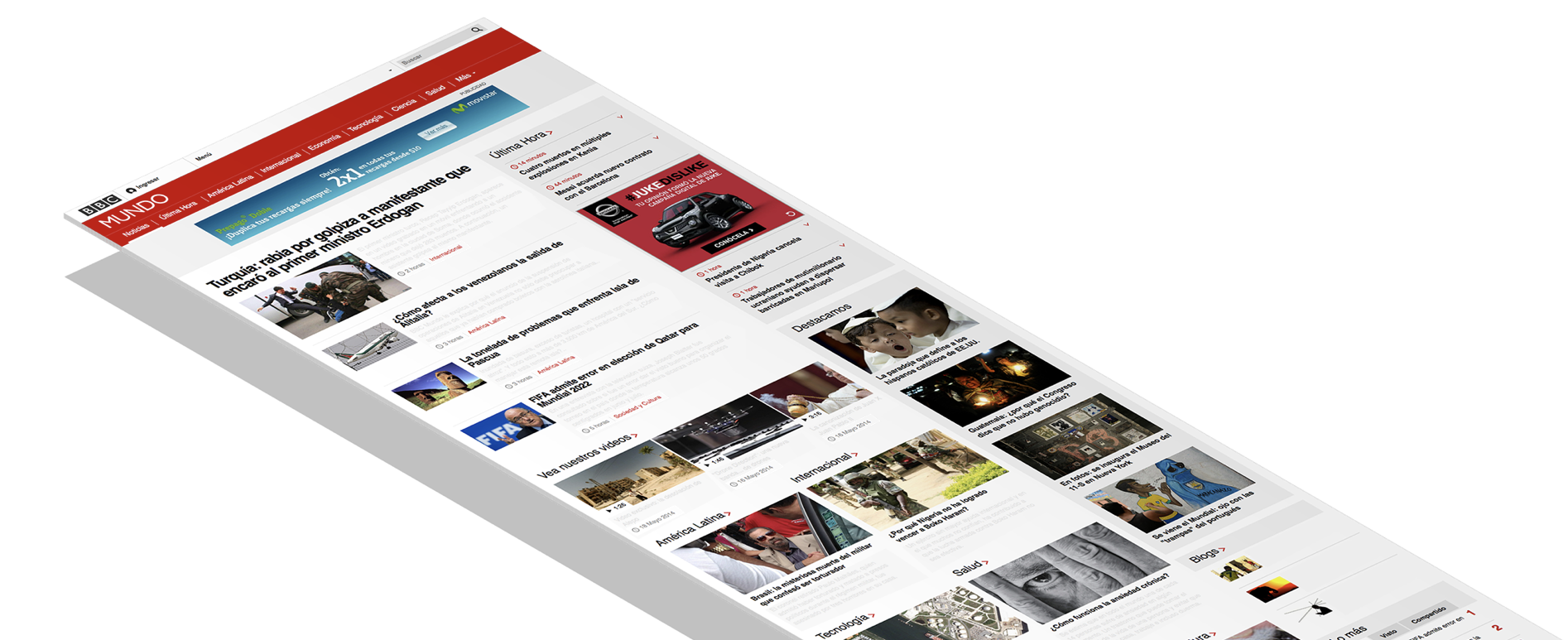
Digest
The use of larger images and smaller headlines helped to slow down the scrolling behaviour.
INDEX PAGES
Less White Space
Smaller font sizes and the bigger images helped to reduce the white space between top stories items, offering a more visual coherence.
“I want to read more. There is a better use of space.”

INDEX PAGES
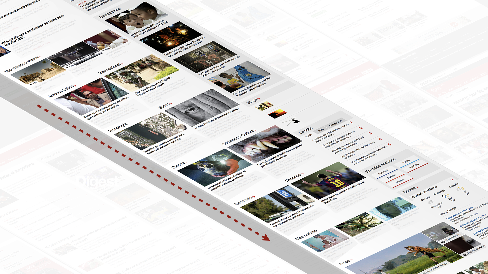
Rolling News
Rolling news – Was only available on the BBC Mundo Prototype, and it was popular among Mexican respondents.
7 out of 10 the majority of Mexican users preferred “Rolling News” on the right hand side of the page. Offered higher visibility and easy access. It offered constantly up-to-date news easy to skim read.
INDEX PAGES
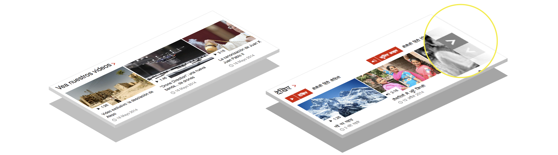
Video Carousel
Another interesting result came from the experience of use the video Carousel.
When first tested in Mexico city, the majority of the participants demonstrated difficulties in find the ‘Back and forward’ buttons during the experiment. Because this was potentially obstructing the user’s experience, the ‘Back and forward’ controllers were modified for the Delhi experiment.
By exposing the controllers, initially hidden, allowed users to explore all the potentialities of this section.
INDEX PAGES
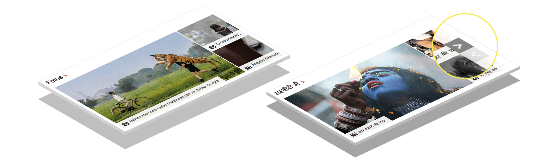
Pictures Carousel
And the same happened with the pictures carousel.
INDEX PAGES
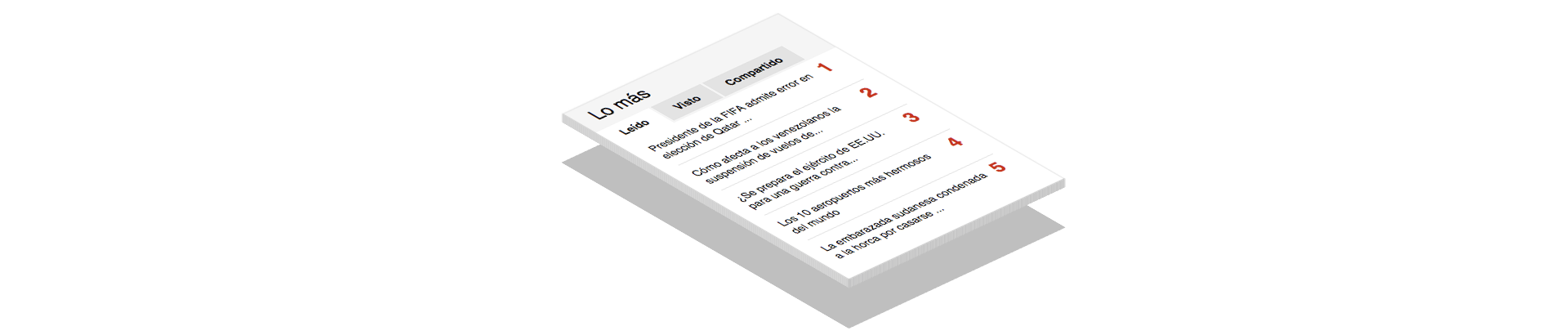
Most Popular
Users in Mexico thought that Most Popular module was too far down the page and therefore too easy to miss.
The organisation of the news by the ranking of its popularity was also denoted as positive element.
INDEX PAGES
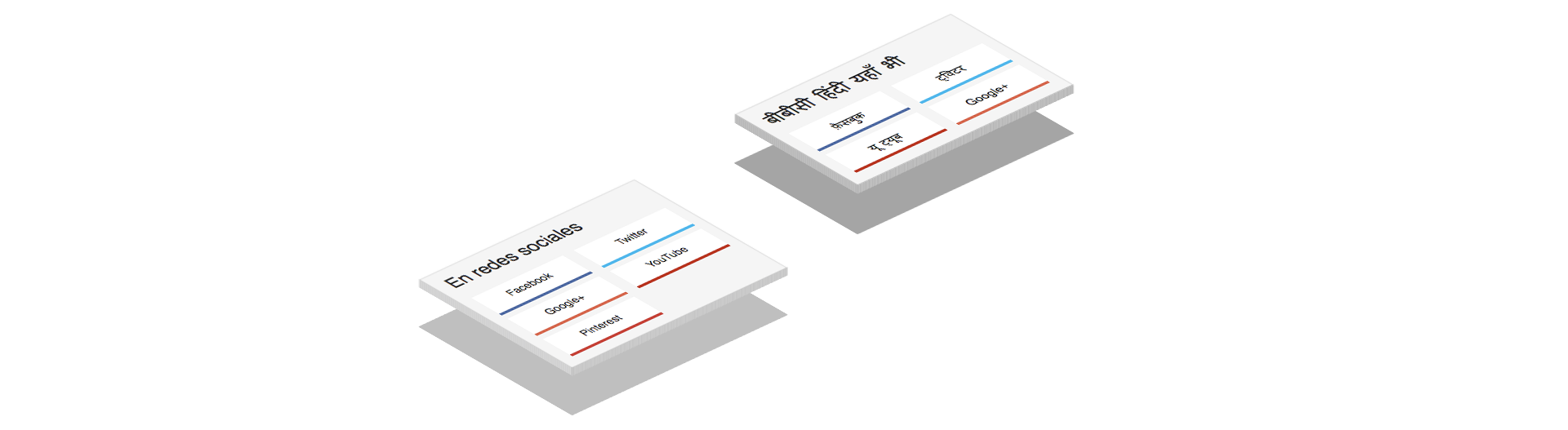
Follow us
The integration of social network connections gave a sense of modernity and innovation to the site, allowing a easier and more interactive access to the News.
In Mexico, the labelling was misleading.
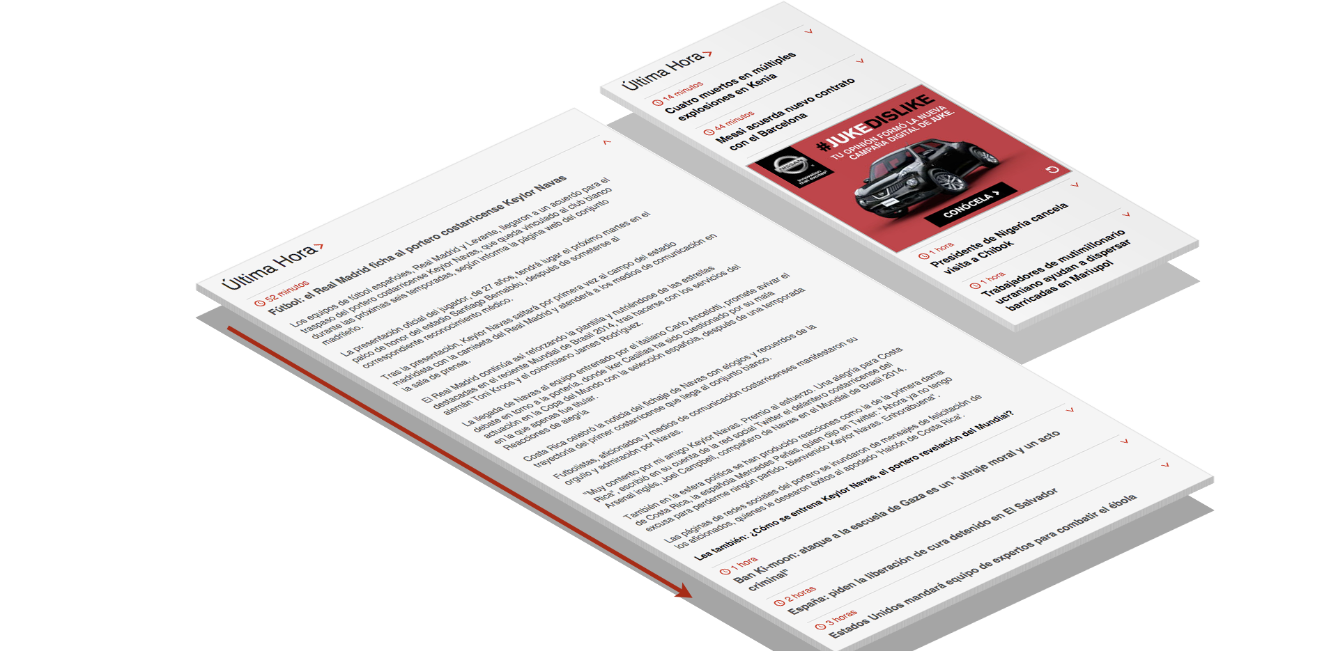
Articles
ARTICLES
High engagement in headline, image & summary text
All Consumed news stories in a similar fashion, high engagement in the initial headline, image and summary text.
“This is very good. The story unfolds well.”
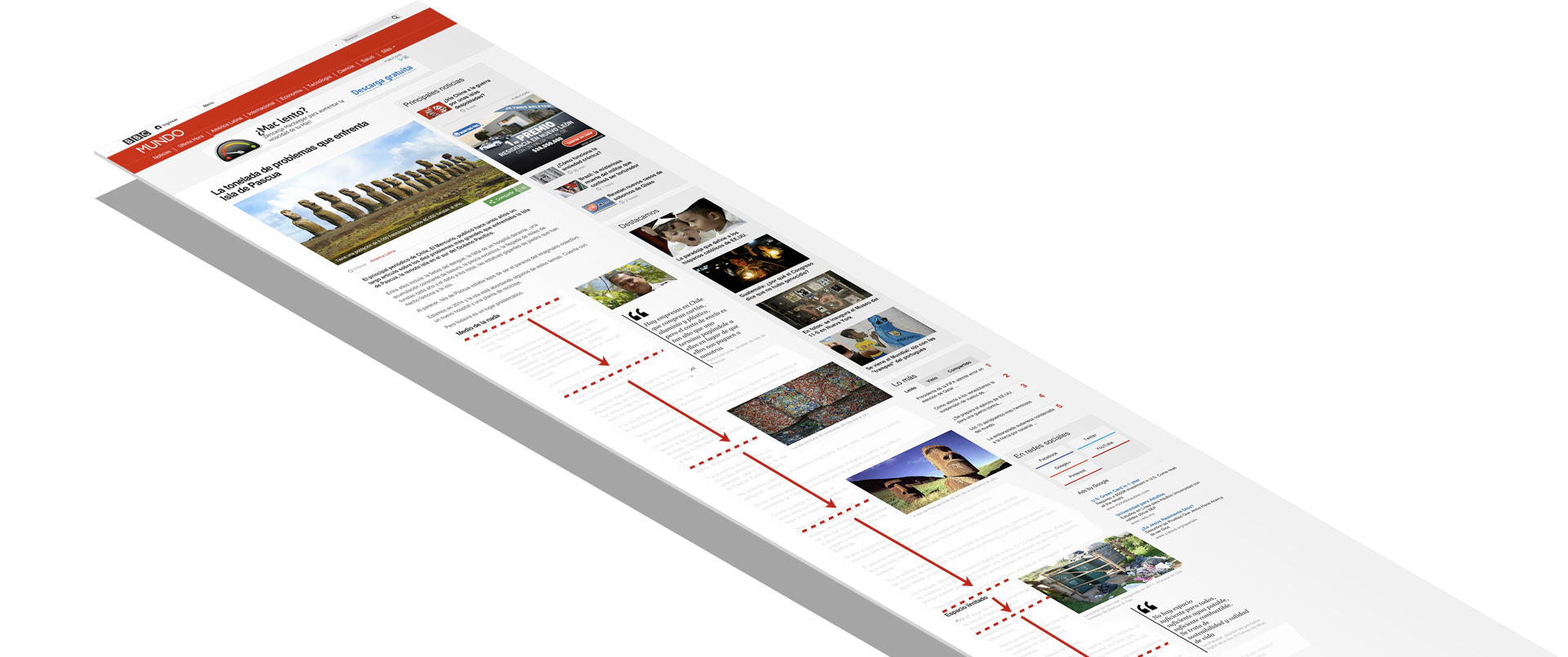
Skim reading often starts after the 3rd paragraph and it stops at the bottom of the article.
ARTICLES
Skim reading
Skim reading often starts after the 3rd paragraph and it stops at the bottom of the article.
ARTICLES
Images, quotes & subheadings helped to ease skim reading
But, stories were seen to be too lengthy & excessively detailed. The majority of the respondents wanted detailed stories but kept to the point and brief as possible.
ARTICLES
ARTICLES
ARTICLES
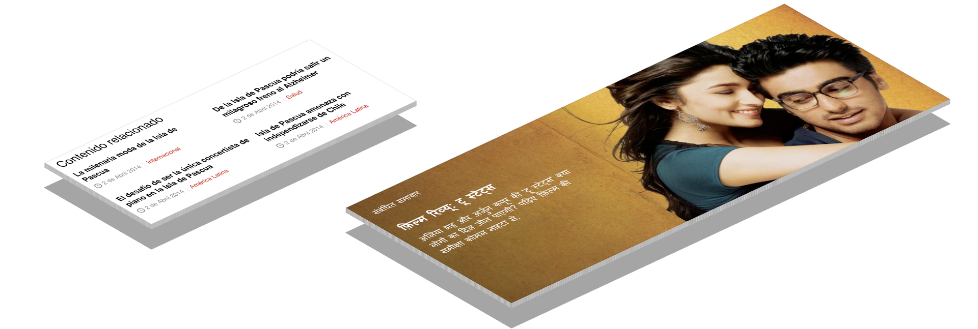
Related Stories
In Mexico, related stories was too low in the page. Text based look & feel lack impact, most of the participants wanted to see imagery.
Few respondents would engage with it. Often related stories are old news. They want to consume news that are happening now.
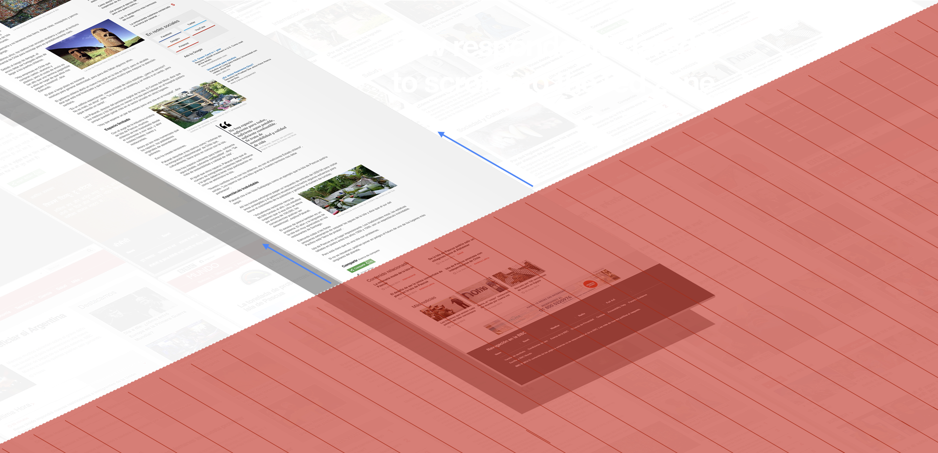
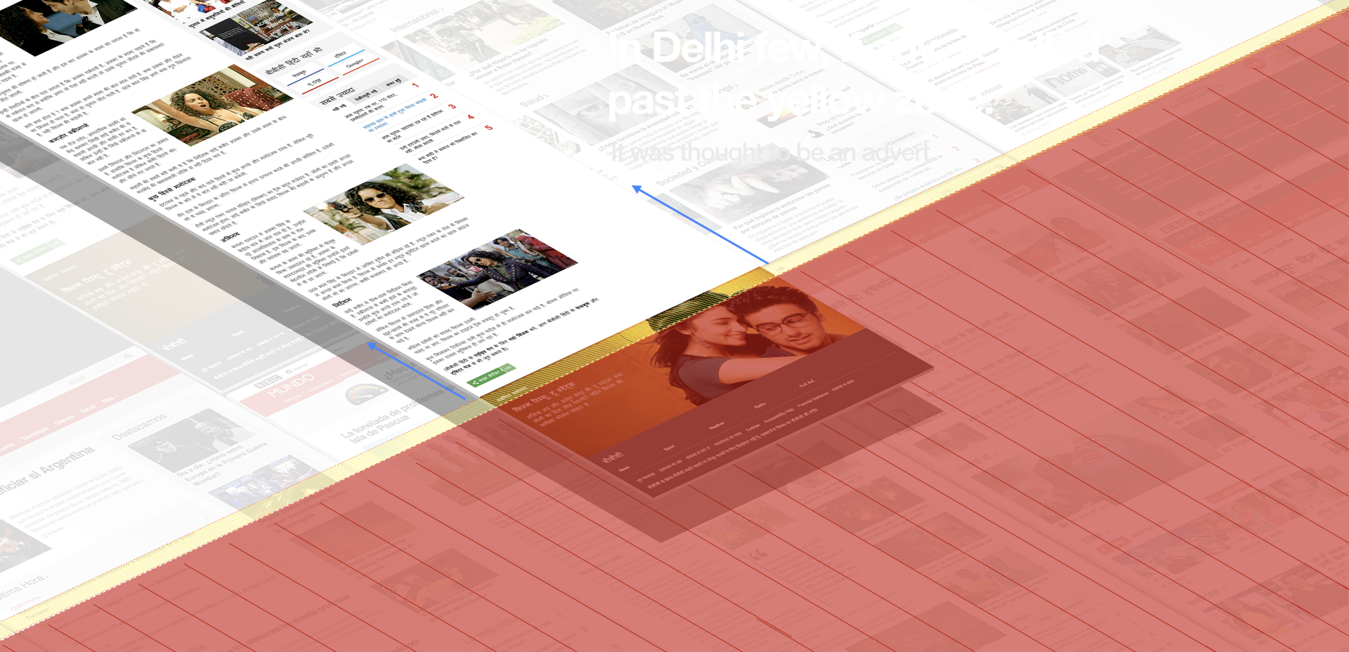
In Delhi, most users did not engaged with related stories. Few or any, didn't get to the end of the story. The large image was thought to be an advert or a footer of the page and therefore avoided. Also, the copy failed to promote further exploration.
ARTICLES
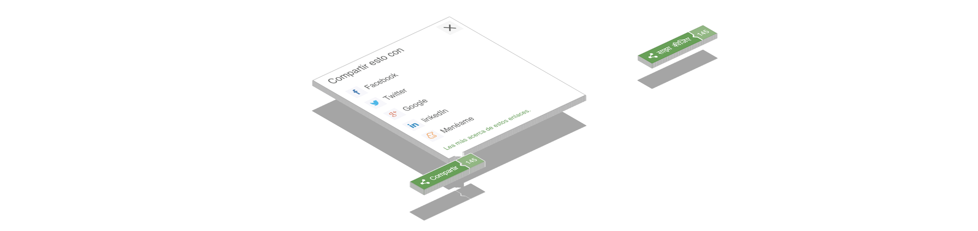
Sharing
Sharing content was important to the majority. The pop-up panel was more appealing than the current MVP share buttons.
In India sharing was recognised by the icon. The sharing label wasn't understood by many.
The number of shares was also understood by the majority however, it is important to highlight that a small number of shares does not have any affect on their likelihood to read a story or share.
“I want to know why everyone is so interested.”
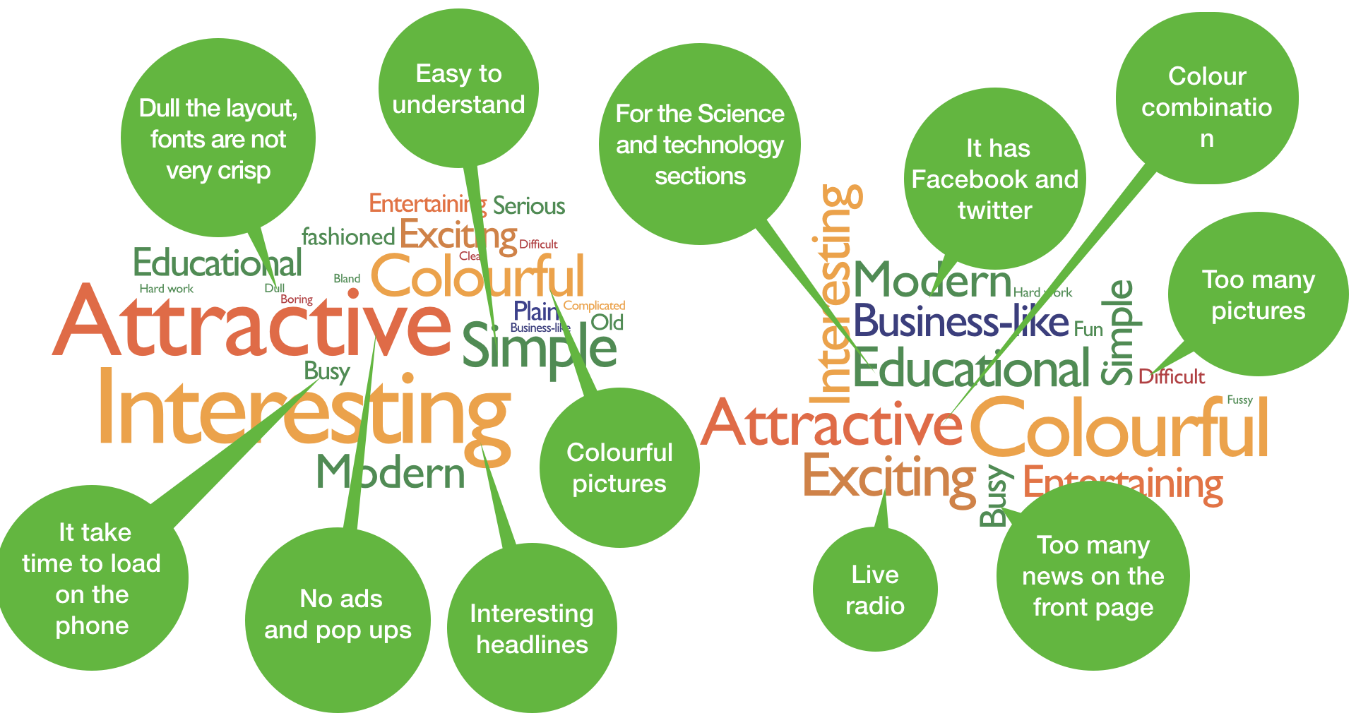
The size of each adjective is proportional to the incidence of the use of the term by participants.
What people thought of the website in Mexico City

What people thought of the website in Delhi
Takeaways
The usability research was fundamental to shape the BBC News responsive site in the right direction. The research findings prompted vital stakeholders to take action in addressing UX concerns.
One of the most significant findings from this research was about content density. Users wanted to have more stories above the fold and wanted to scroll less, but also, they expect news websites to be bustling with stories.
Testing HTML prototypes that look and behave like the end-product helped the participants to act in their natural behaviour when using the site, allowing us to capture genuine insights into users' behaviour.
The final solution for the BBC News responsive website was an evolution of the existing version of the 'static' site rather than a radical re-design. The aim was to provide a much cleaner and clearer layout across all devices.